Menu

Menu
Easily save money so customers can focus on living
With the growing demand to integrate AI into customer-facing products, Commonwealth Bank set out to integrate a smart savings tool that would help customers budget and save money—effortlessly. The goal was to create an experience that uses AI to automatically analyses spending habit patterns and identify safe-to-save moments, allowing customers to grow their savings without needing to actively manage a budget.
• Product Designer
• Design user research
• Prototyping & testing
• Stakeholder collaboration
• Illustration & animation
• UI specifications for developers
Designing a new AI-powered savings tool came with several layers of complexity—both for users and the business.
Introducing a new concept in a complex space
Budgeting and saving are already mentally taxing topics for many users. Introducing a new, automated savings model—powered by AI—meant simplifying a complex idea in a space that’s already hard to navigate. The challenge was to communicate how it works in a way that feels intuitive, and not overwhelming.
Building trust in automation
Asking users to let an AI decide how much of their money to save required a high degree of trust. Users needed to feel confident that the tool wouldn't compromise their financial stability. We had to design with transparency, reassurance, and control in mind to reduce anxiety around “invisible” financial decisions.
Designing amid uncertainty
At the time of design, the AI algorithm was still being developed. This meant we had to make early product decisions based on evolving technical specifications. Translating these unknowns into a clear user experience required close collaboration across business stakeholders, product, data science, legal & compliance, copywriter, and engineering—while still keeping user needs front and center.
Balanced between customer & product
It was important that product meets with customer's needs and concerns, its a two-way process. Rather technology driving the design requirements. Collaborating & aligning across teams and sharing user findings was crucial to the design process, following a structured, user-centered approach.
Understanding the problem space
I began by conducting exploratory research into how users currently manage their budgets and savings. Key insights showed that while most users wanted to save, they either didn’t know where to start, or lacked the time and mental energy to actively manage it. This validated the need for a passive solution.
Competitive analysis
Understanding what is in market and how other businesses approach a A.I savings feature was important to get a baseline on how its already perceived in the market.
Through interviews and testing early concepts, we uncovered users' hesitation toward automated savings.The key drivers of trust were control, clarity, and predictability.
Designing for clarity
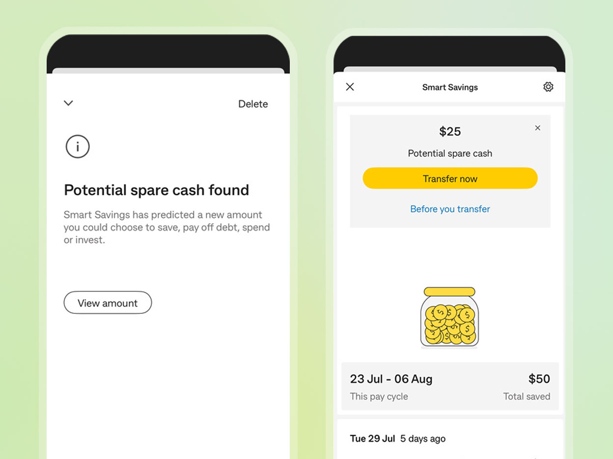
It was paramount to explain how Smart Savings works in the simplest way possible while addressing any uncertainties. Using clear UI elements—such as an animated graph during the onboarding journey—helped improve comprehension and build trust. Additional UI cues, like “Why this amount?” explanations and breakdowns of how savings were calculated, further reinforced transparency. Since learning can be a significant cognitive load for users, I looked for ways to make the experience engaging, breaking information into small, digestible chunks.

CommBank Dashboard to Smart Savings feature
"Don't make me work" - quote from user testing
One key insight that informed the product design was that users didn’t understand how it aligned with their pay cycle. To remove this friction, we designed the product to automatically detect their income schedule and sync savings cycles with it.
Animation during onboarding: how the algorithm works
One of the biggest challenges with automated AI is trust—specifically, how to make users feel in control of something that’s largely running on its own. User testing made it clear that autonomy was key, so I designed moments where users could set the parameters themselves.From the very start, during onboarding & the settings page, we invited users to tailor the feature to their comfort level.
They could:
• Select the account for transactions
• Choose whether to receive notifications
• Pause or stop the feature at any time
• View a transaction history to pay cycle
• Set a maximum transfer amount
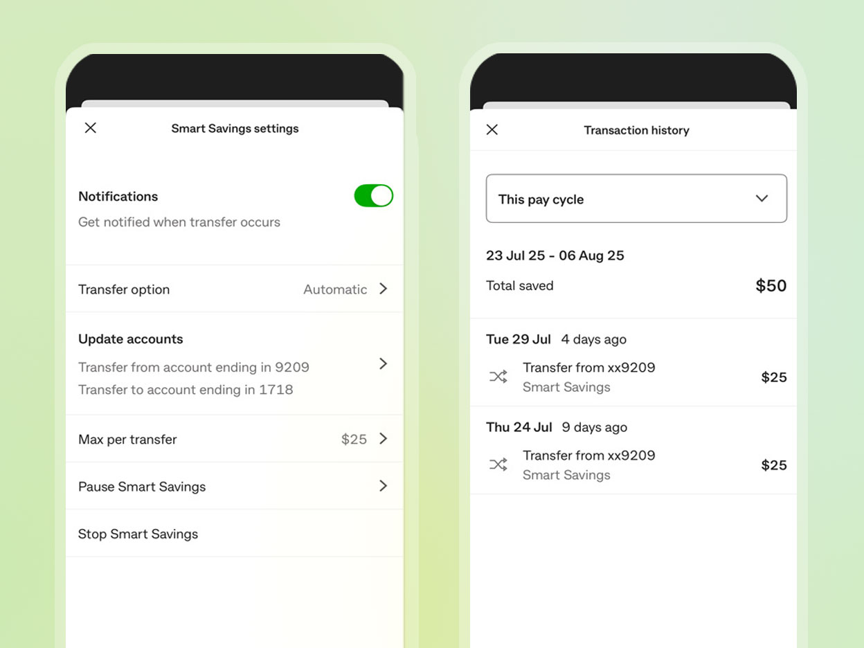
Settings page: Automatically detecting a users "Pay Cycle" into the algorithm
Early in user testing, we discovered people didn't want saving modes (low, medium, high) especially when we are not explicitly telling them upfront how much is being transferred into their savings.
Allowing users to have a 'transfer option', either automatic or approved transfer was positively received. These controls gave users confidence that automation was working with them, not for them—building both transparency and trust from day one.
User in control: Have an option to allow users to confirm transfers
Objective
Understand impact of in-journey insight on customer transfer behaviours tied to achieving their goal (eg. pay down debt, invest, savings towards a goal).
Hypothesis
1. Customers will have more propensity to transfer money over when they have a reference point of their overall account balance.
2. Customers are more likely to reach their money objective (e.g. pay off debt, save for a goal, invest) by having the overall account balance reference point.
Outcome
Users were much more engaged when they see the long term impact of saving. To associate a goal, helps users to focus and stay on track to their reason they are saving. With a reference of their current balance and the goal in mind, they can monitor and check in their progress. Seeing the tally of small consistent amounts informs users that every cent counts.
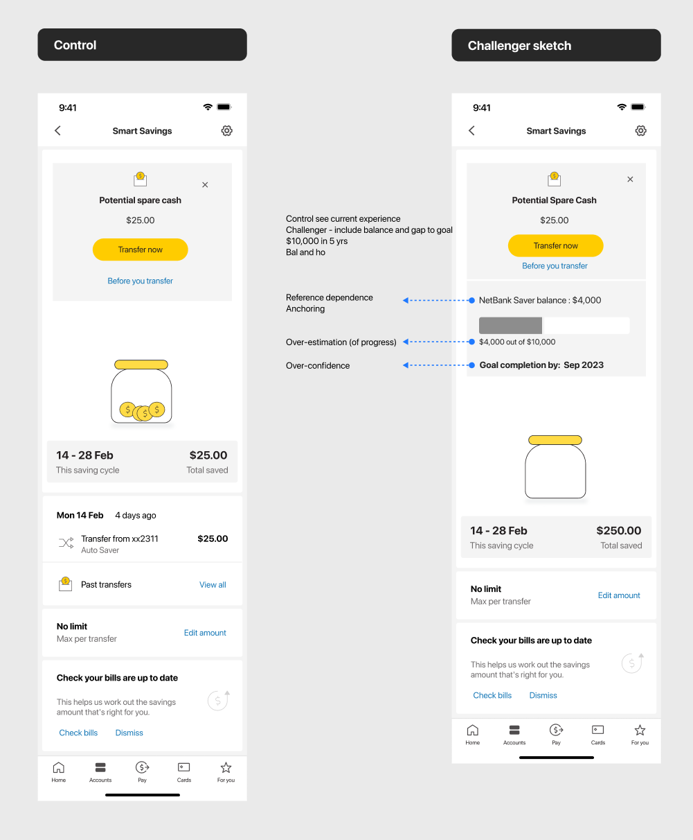
Control vs Goal test
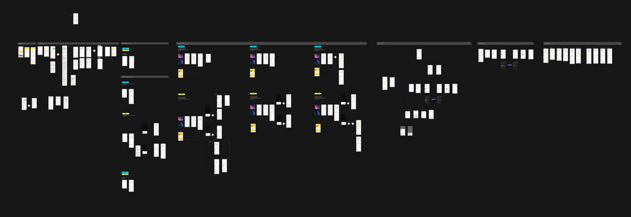
Figma screenshot of end to end user journey
Mapping out completely:
• Entry points
• Onboarding
• First transfer
• In-life experience
• Dashboard notifications banners
• Settings
• Max transfer
• Account closure
• Account stop
• Transaction history
• Edge case scenarios
• Paused experience
• Feedback toast
• Terms & Conditions
• Error scenarios
• Adding a goal (horizon 2)
My design approach helped shift a technically complex, trust-sensitive idea into an accessible, user-friendly experience that customers could understand—and feel confident using.
Clearer user comprehension of a complex feature
User testing showed a significant increase in understanding AI-driven savings logic was explained visually. The addition of contextual cues like “Why this amount?” and “You can always change this later” made users feel in control, even when savings were automatic.
Increased user trust in automation
By focusing on transparency and optionality, we reduced user anxiety around “losing control” of their finances. Users responded positively to features like adjustable limits, savings summaries, and notifications—key design choices that gave AI a human, helpful face.
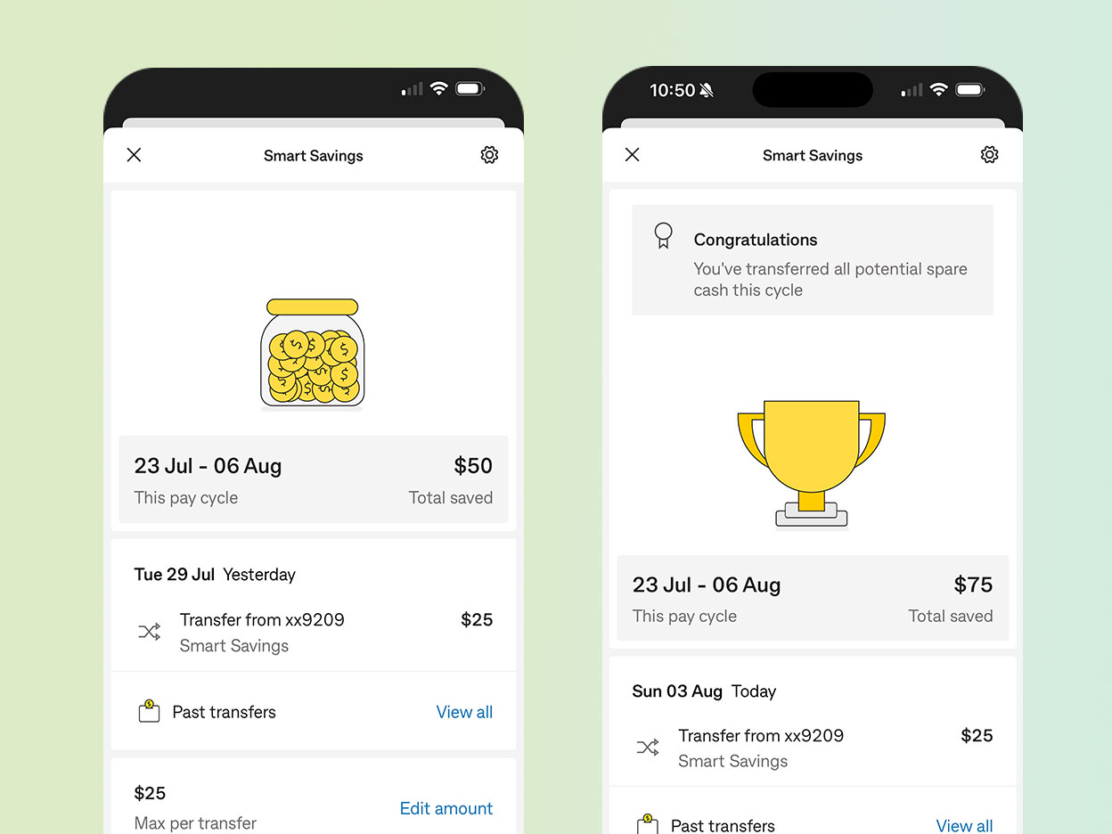
Saving money can often feel dry, invisible, or even anxiety-inducing—especially when it's happening passively in the background. To counter this, I introduced subtle animation and gamified elements to the experience.To bring a sense of progress, I added a number counter. Spare change associations, a coin jar filling up. And emotional reward, confetti then the jar transforms into a trophy.
Tone & Style
All animations were kept minimal and consistent with Commonwealth Bank’s design system—friendly, trustworthy, and non-intrusive. The goal wasn’t to “entertain,” but to subtly reinforce positive behavior and emotional satisfaction.These moments of delight helped transform saving from something invisible into something tangible and rewarding, adding engaging UI and creating a more emotionally resonant product experience.Set the foundation for future AI-first features The patterns we established for onboarding, terms & conditions, notifications, and settings can now be reused across future AI-powered tools at Commonwealth Bank.
The first 12 months, we had 4.1 million savings transfer, uplifting our customer Financial wellbeing score.
And within the first 6 months we had 300k+ unique customers start onboarding. Increasing engagement within the app, and seeing long term customer saving habit improvements.
Reflection & learning
What I learned about designing for AI, is that constant communication is important, especially between data scientists, compliance & legal. There were limitations in how we frame the language, and it was key to have signed-off language from legal & compliance early on for user testing.
Testing early was very important, customers concerns were early on communicated to the team and stakeholders, which allowed for the team to pivot based on early user findings. It was an user centred design approach from the get go. Where requirements derived from customer insights & user needs.
There are a lot of unknowns and working through the algorithm, product specifications, design & delivery at the same time was honestly intense. Taking time to step back was important for clarity.
Changing users behaviour was challenging (every product designers challenge), and finding a way to distill automated complex notions to real-world associations into a very simple, transparent and easy way was so crucial in gaining that trust.
Customers want saving to be easy and fun, and being able to add delight into the design allowed me to explore more creative ways.Lastly, one of the things I wish I did more was to ask more questions. Never assume, and there is never a bad question, it only creates more uncertainty.